install.packages(“ggplot2”); library(ggplot2); You can now use all the functionalities of ggplot2. ggplot2 has two basic components: aesthetics, which is all the data and elements, which is the kind of visualisations you want – viz bars, lines, heat maps, etc.  Average annual score plotted versus every year – the default setting In the console, let’s try the following: ggplot(sachin, aes(Grouping, Average)) + geom_point(); This yields the same graph as the one shown above with the difference being the ability to customise. Type the following:
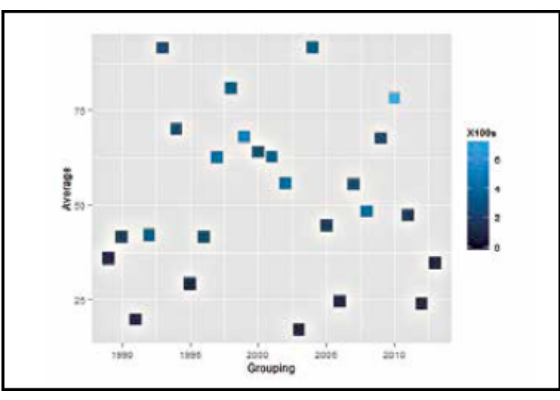
  Average annual score plotted versus every year – slightly scaled up graph. Notice how everything seems to appear a lot more ‘averaged’ and ‘flattish’ ggplot(sachin, aes(x=Grouping,y=Average,colour = X100s))+geom_point(shape=15, size = 6, alpha = 0.8) This gives a plot of averages versus grouping, except each point’s shade is determined by the hundreds – lighter the shade, more the number of centuries that year. The shape and size can be changed accordingly, and the parameter ‘alpha’ determines the intensity of colour. Replace ‘X100s’ with ‘X50s’ and you’ll get the point shaded according to the 50s scored. ggplot(sachin, aes(x=Grouping,y=Average,colour = X50s))+geom_ point(shape=15, size = 6, alpha = 0.8) This brings some new insight into the dataset – for example, it shows that the more 100s he scores, the higher is his average. However, his highest average runs in one year need not have the maximum number of centuries – indicated by the lighter points occupying a band of points just below the maximum score. Even with the 50s (replacing X100s with X50s), you see a similar pattern although maximum runs in a year is also very close to the year with maximum number of fifties. This sort of an analysis, called ‘correlation’ is central to every aspect of study – from cricket stats to the population of tigers in a jungle. There are several built-in functions and dozens of sources from which you can get interesting plots and analyses. Interface and Interfacing Each of these plots can be saved in PDF or JPEG formats with the simple click of a button. Just click on the ‘Plots’ tab in the bottom right window, select ‘export’ and choose the required option. You can even adjust the size and aspect ratios before saving.
  EU27 trading data from the BEC group since 1999 – a beautifully coloured graph for a seemigly drab data set! There is extensive help available for R. You can search online forums for commands and codes, or if the command is known, a ‘?’ followed by the name on the console will give all the information on the respective command. R has one of the largest numbers of packages and these are still growing. Several languages and GIS applications can be integrated with R, apart from visualisation. Basic R charts and graphs are the basis for several infographics, which you can then polish up with some art to improve visually appeal. You can even make interactive graphs with given data, similar to the one just described. http://www.rstudio.com/shiny/showcase/ has several such examples. RStudio’s package ‘Shiny’ makes it super simple for you to turn analyses into interactive web applications that anyone can use. It lets you incorporate parameters such as sliders, dropdowns and text fields, and gives you control over the number of outputs you want to add such as plots, tables and summaries. Shiny also provides a guide to creating such interesting apps.
Creating stunning visualisations using R
Pages: 1 2